Select a Scope.
What do you want to visualize?
The tool offers different visualizations for documents, journals or authorship relations.

Choose a Tabulation for the selected scope.
Tabulations represent how the data will be grouped. For example, you can see how the number of documents is distributed by SciELO Collection, or by thematic area of the document.

Choose Visualization type.
You can represent the data geographically on a map, or represent its distribution or dynamics over the years. Choose the representation you want.

Analytics
Visualizations

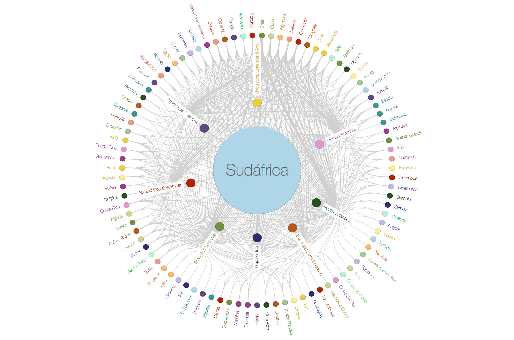
Analytics Visualizations is a powerful visualization tool for SciELO network.

Through a series of visualizations, you will be able to navigate and interact with this data analyzing the distribution of documents, journals or relations of authorship in this scientific bookstore.

Explore the different options!